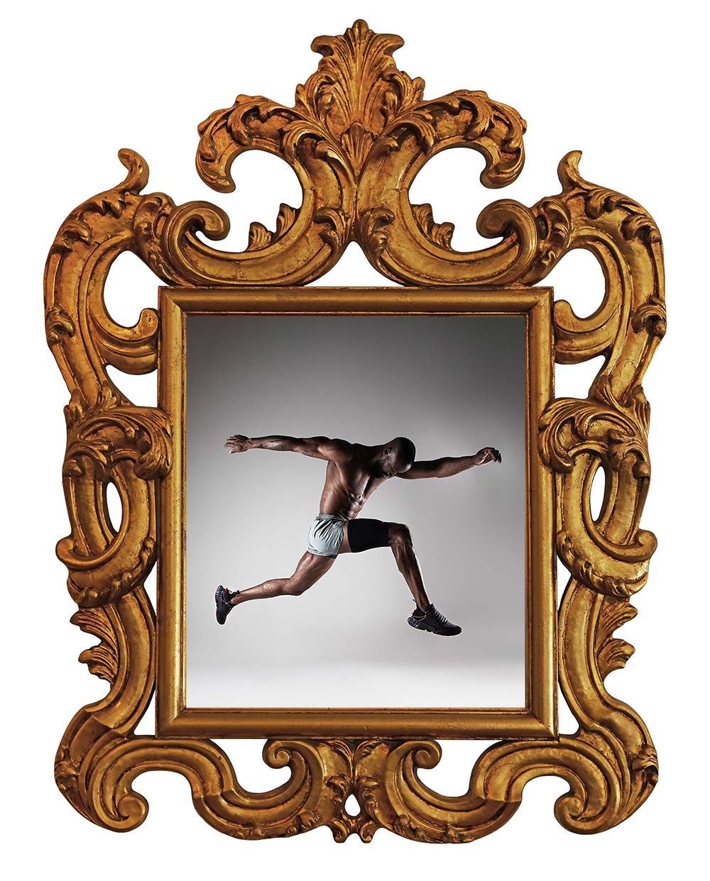
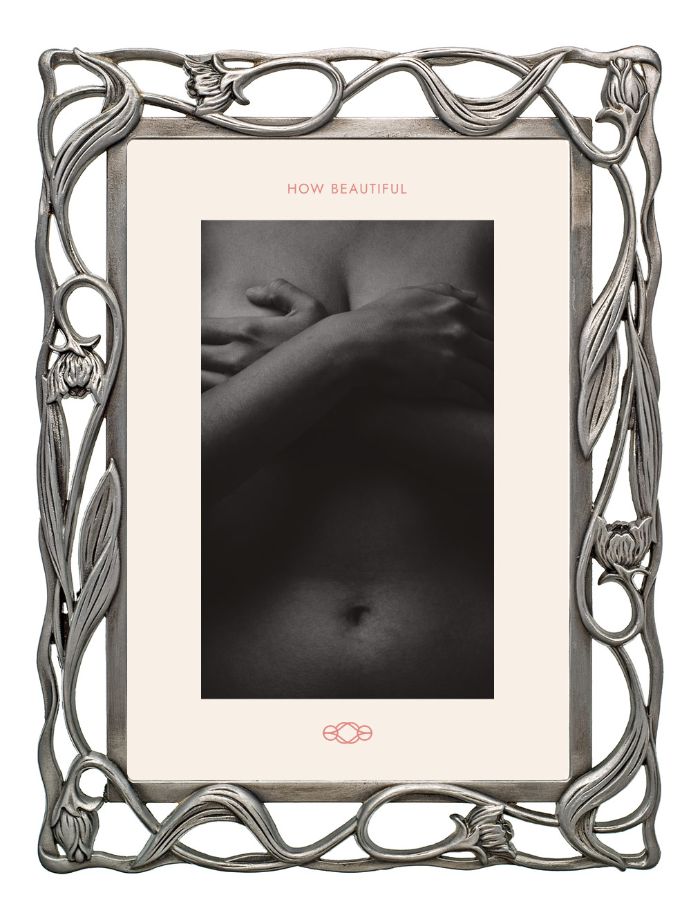
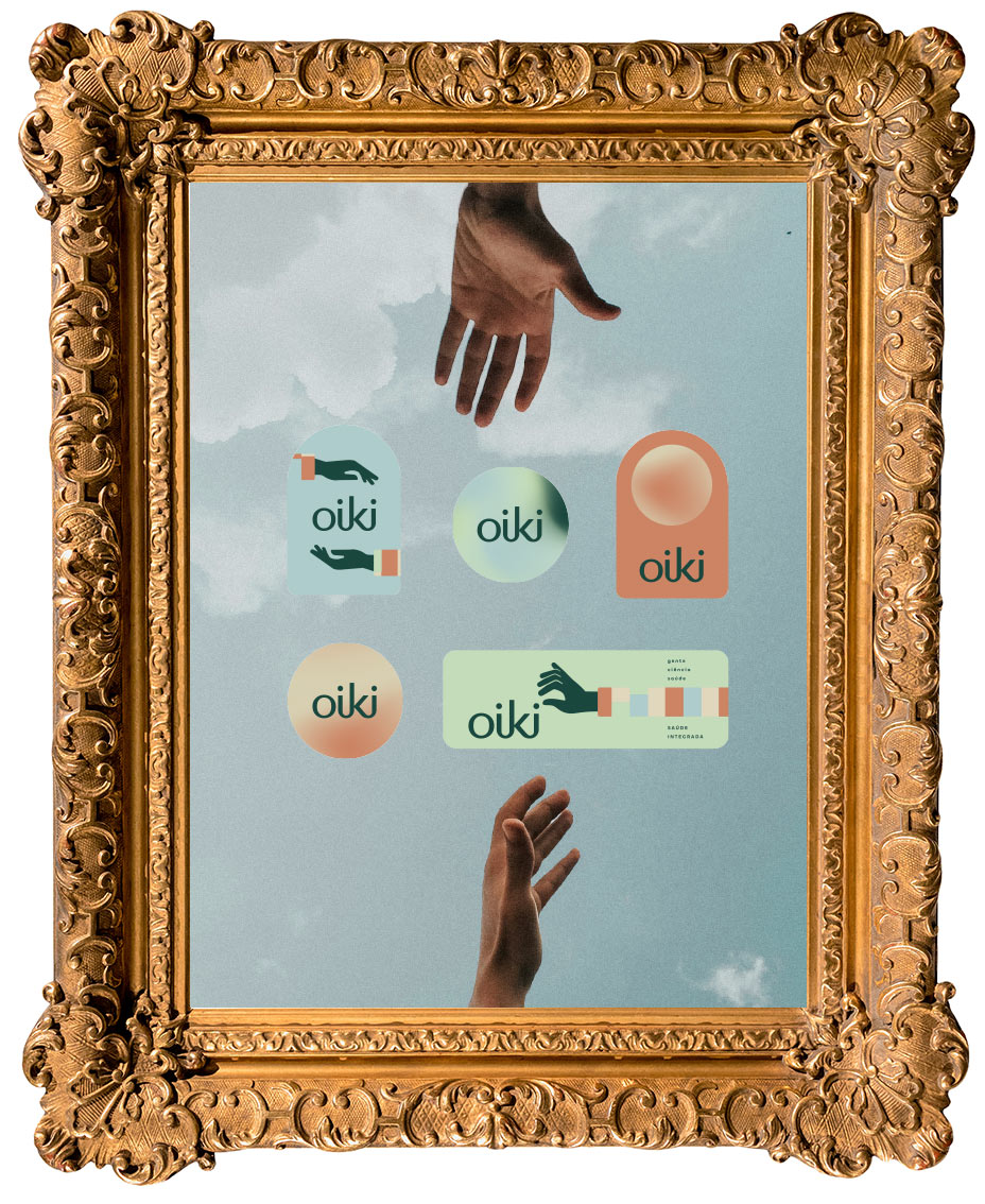
"It was a joy to see your creative eye give shape to Oor’s identity. You understood with great sensitivity what I wanted to convey—balance, naturalness, and sophistication—and translated it all with exceptional professionalism. The result is exactly as I imagined: harmonious, elegant, and full of soul. I’m very pleased with your work and recommend you wholeheartedly."
brand strategy & visual identity

museums are my favorite place so, why not present my work like that?

Hope you enjoy the visit!


Creations with Form, Color, and Soul


TAMARA BARBIAN
brazil
CREATIVE DIRECTOR
master of design_2015
bachelor of design_2012
The life here and there is the greatest creative archive there is.
For nearly two decades, I’ve curated stories across mediums: graphics, footwear, accessories, toys, furniture. Each discipline adds a room to the collection.
My references drift from art and classical music to museums, vintage treasures, and the poetry of everyday things. Beauty is everywhere for those willing to look twice.
Looking back, I’m grateful for the projects and people I’ve worked with, and for the experiences I’ve led—from directing initiatives to publishing in design journals and earning a national award.
The exhibition continues—there’s so much still to make.

TAMARA BARBIAN
brazil
CREATIVE DIRECTOR
master of design_2015
bachelor of design_2012



RESULTS
YOU CAN FEEL
"I had known Tamara’s work for a long time. When my partners and I set out to create our new brand, we reviewed several portfolios and—unsurprisingly—hers captivated us for its uniqueness and creativity in every respect. It was our first experience with naming and branding, and we were amazed by the process because everything was new. Tamara has a remarkable gift for capturing exactly what we wanted for this new chapter, and—amazingly—she presented a name and brand we loved from the very beginning. It was beautiful 🤍. All of our characteristics were thoughtfully reflected, allowing us to express precisely what we had in mind. How lucky we are! I recommend her wholeheartedly"
"The OHA rebrand changed many aspects of the brand, but to keep this objective, I’ll focus on three very clear points:
First: perceived value. OHA began to be seen as a signature brand—with concept, voice, and intention. That was something we had worked very hard to achieve. Since the rebrand, a more conscious, values-aligned customer profile has come closer—and stayed.
Second: internal clarity and honoring our story. The rebrand organized our identity. Today we have a much clearer understanding of who we are, what we sell, and, most importantly, what we do not sell—and what we do not want. This is reflected in firmer decisions, less improvisation, and more coherence in our communication.
Third: opening new opportunities. Partnerships, invitations, and conversations began happening on a different level. This positioning elevated OHA into a more strategic dialogue with architects, brands, and curated experiences. And we’ve been seeing many positive results from this shift.
Speaking of financial impact: the quality of our sales improved. Our average ticket increased, because our symbolic value started being communicated and perceived more effectively.
Aspolka Design continues to be our choice for every new creation and for all strategic direction behind new initiatives within OHA. So here is my most sincere recommendation to anyone seeking work that is impeccable, deep, and fully personalized: Aspolka Design immersed itself in the essence of our brand to deliver a rebrand of the highest level. Because of that, we didn’t just receive a new visual identity—we experienced a shift in layer, a transition in mindset, and a new level across every sector of the company.
And that changed our entire story.
Aspolka, always: thank you for so much!

Exhibition under installation.
Thank you for your understanding
CONTACT
Email: tamara@aspolka.com
Phone: +55 51 99184-8998

